A Quirky Problem: The Lynx in My Domain, But I’m Not a Cat Person
My personal domain is lxlynx.com, and every product under it carries the Lynx prefix—LynxFlow, LynxPipe, LynxAct. By the usual playbook, the brand logo should depict a lynx: a feline with two iconic tufts of black fur on its ear tips, highly recognizable, a favorite motif for logo designers.
The problem is I genuinely dislike lynxes. I’d already tested several lynx directions on my comparison tool—heraldic, streamlined, double-tufted—and deleted every single one. But the “lynx” in my domain and the letters LX are real assets I’m not about to toss.
So the brief became clear: preserve the LX letterforms, abandon the animal imagery entirely, and design a logo for an AI tech company.
First, Figure Out What I Actually Like
Before making a single mark, I reviewed my history on the comparison tool. I’d previously built a little app called lynxcompare specifically for visual decisions—the core idea being that choosing a logo shouldn’t be a single high-stakes gamble. Instead, stockpile candidates and cull them gradually. Every “keep” and “delete” click gets logged.
Flipping through the records, my taste signals were strikingly clear:
- Kept: LX infinity (a single continuous line forming the ∞ glyph), neural infinity, iris eye, aperture, crescent, ripple, spark
- Deleted: heraldic lynx (too ornate), dual-iris composition (too information-dense)
Translated into design language: I like continuous single strokes, minimalist geometry, eyes and the idea of gaze, the ∞ symbol; I dislike ornate crests and overloaded compositions. This profile became the evaluation rubric for everything that followed.
Putting an Agent Pipeline to Work
This time I didn’t sketch anything by hand. I built a multi-agent pipeline in three stages:
Stage one: research. Two agents worked in parallel—one scoured 2025–2026 AI company logo trends to identify overused符号, and the other dissected classic cases: OpenAI’s minimal knot, Vercel’s triangle, Stripe’s three lines, Cursor’s pen nib—extracting the construction techniques that hold up at 16 px.
The two most useful findings: gradient spheres and four-point sparkles are completely saturated; new logos should avoid them. And three things make a logo legible at 16 px—high contrast, bold strokes (line weight at least 6 px), and no fine details.
Stage two: generation. Four agents each tackled one family, producing 8 candidates apiece:
- Continuous single-stroke lines — carrying forward my favorite LX infinity lineage: Möbius, knots, ribbon folds
- Eye · iris · observation — the eye family I love, minus the feline: aperture iris, radar eye, negative-space eye
- LX wordmark — L and X rendered as shapes, no ears or paws attached
- Abstract AI symbols — tensor grids, singularity convergence, orbital metaphors: none relying on eyes or letters
Stage three: review. A dedicated “devil’s advocate” agent scored every candidate against the research findings and my taste profile, eliminating SVG render failures, blacklist hits, and anything that would blur into a blob at small sizes. Thirteen of the 30 candidates survived.
After the Machine Review, the Human Eye Still Has to Weigh In
Once the 13 passing concepts went up on the comparison tool, I did the one thing the pipeline couldn’t automate: manual visual inspection. It immediately caught four that looked nothing like their labels—for instance, one called “LX infinity” whose SVG path ran outside the canvas bounds, rendering as something that looked like a question mark; another called “orbital pupil” with three elliptical rings spaced too closely, collapsing into a solid dot at 16 px. These slipped past the review agent because it was reading path coordinates, not rendered output.
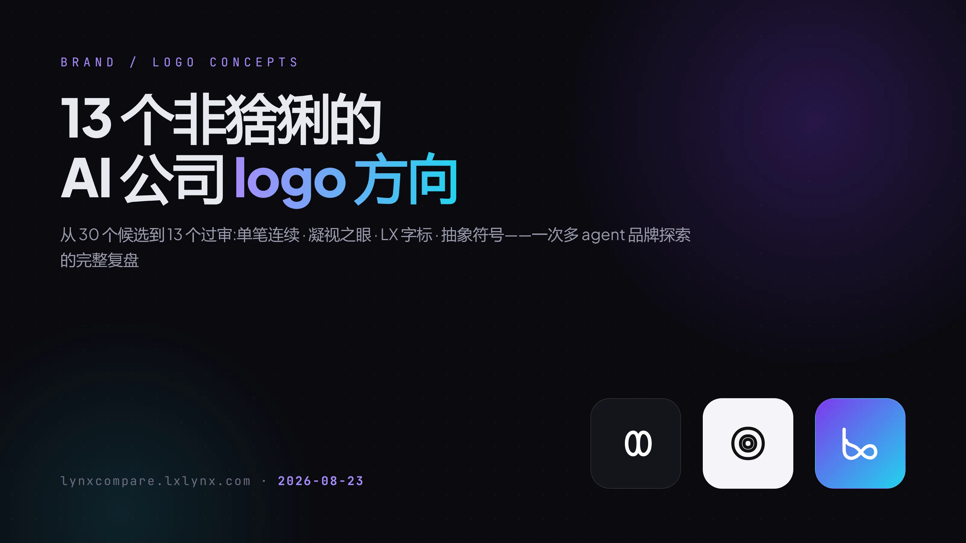
After fixes, all 13 directions now live under the AI Company New Directions tag on the comparison tool. Each is shown on dark, light, and gradient backgrounds, with 16/24/32 px缩放 previews and real-world LynxFlow watermark tests.
A few that stand out to me:
- Dual-ring infinity (score 92): two symmetrical rings forming ∞, a single unbroken stroke. Same lineage as my earliest-kept LX infinity, but cleaner.
- Gaze core (90): three nested outlines with a pupil that steps inward, reading as both an eye and a lens—still crisp at 16 px.
- LX gaze (83): a circle with four radial ticks, like a crosshair or compass, with the X hidden in the cross—thick 8 px strokes, rock-solid at small sizes.
- Orbital pupil (80): two intersecting elliptical orbits around a solid core, a classic atomic structure.
A Few Takeaways at the Brand Level
This round of exploration surfaced a handful of judgments worth more than any single logo:
First, the visual language of “intelligence” is shifting from “magic” to “gaze.” The four-point sparkle was the universal AI visual vernacular of 2023–2024, and it’s now so overused it’s lost all differentiation. Eyes, apertures, orbits—imagery of “continuous observation and focus”—is the more distinctive direction today. Conveniently, that’s also exactly my personal taste.
Second, letter assets can be inherited abstractly without becoming literal. I don’t need to draw a lynx to justify the domain. Geometric recombination of the LX letters—joined strokes, hidden forms, orbital treatment—carries the same domain value, and an abstract mark avoids the baggage that any animal brings.
Third, the right tool for visual decisions is “hoard first, cull later,” not “pick one and go.” Of 30 candidates, only 13 survived. Half of the 17 cut were eliminated by the review agent; the other half fell to render inspection. Without the comparison tool keeping all candidates side by side and logging every keep/delete, this whole process would have been impossible.
What’s Next
All 13 directions are live. Now it’s time to let time do the filtering—no rush to decide. I’ll leave them up for a week, glancing each time, keeping or deleting on instinct. With visual decisions, the thrill of the first look and the endurance of the hundredth look matter just as much.
All candidates: lynxcompare.lxlynx.com → AI Company New Directions tag.