
TL;DR
I fed 39 on-chain trades into 10 competing strategy hypotheses on AlphaTrace, the quant analysis platform I built myself, hoping to find “what method these trades are most likely following.” The top-ranked strategy ended up resting on just 3 valid data points, and its explanatory power was the lowest of all ten hypotheses — it took the crown purely because it’s the simplest.
That’s not a bug. This is what an honest quant analysis is supposed to look like: the explanation that fits best is not necessarily the explanation that’s true.
What the Platform Does
AlphaTrace does one thing, and it’s simple to describe: pull the trading history of a public on-chain address, reconstruct what the market looked like at the exact moment of each buy, then let a roster of classic strategies (momentum, breakout, mean reversion…) compete to see which one best explains why those trades happened at those moments.
What it gives me is always the “most plausible hypothesis” — never “the definitive truth,” and definitely not a “guaranteed money-maker.” This time the data was: 39 trades, covering 23 tokens, spanning June 2024 to September 2026.
The Story of the #1 Hypothesis
After the hypothesis tournament finished, all 10 hypotheses were ranked by total score. The winner is called funding_oi_signal — the funding rate / open interest signal — with a total score of 0.563 and just 1 parameter. The name sounds impressive: “uses funding rate and open interest signals to explain trade timing.” But the first line of its evidence section gives the game away:
3/39 fingerprints carry real funding/OI data (of the 39 trades, only 3 actually have funding rate and open interest data)
39 trades, and only 3 of them carry the key data this strategy needs. This “#1” is propped up by 3 trades.
What’s more sobering is its six subscores. The platform grades every hypothesis on six dimensions:
- Explanatory power: 0.38 — Can it explain his past moves? This is the lowest of all ten hypotheses.
- Predictive power: 0.58 — Can it anticipate what comes next? Mediocre.
- Stability: 0.49 — Does it still work in a different time window? Mediocre.
- Robustness: 0.90 — Does the conclusion survive small parameter changes? Very high; the validation page later confirms a “plateau.”
- Out-of-sample: 0.62 — Does it hold up on data it has never seen? Mediocre.
- Simplicity: 1.0 — Fewer parameters means more trustworthy. A perfect score.
See what’s going on? It tops the total ranking on the strength of a perfect simplicity score plus a high robustness score — not because it “explains things correctly.” Its explanatory power is dead last. A hypothesis with the weakest explanatory power took the championship because this scoring system rewards “simple” — the fewer parameters, the higher the simplicity score, and the less likely the result was luck-fitted into existence.
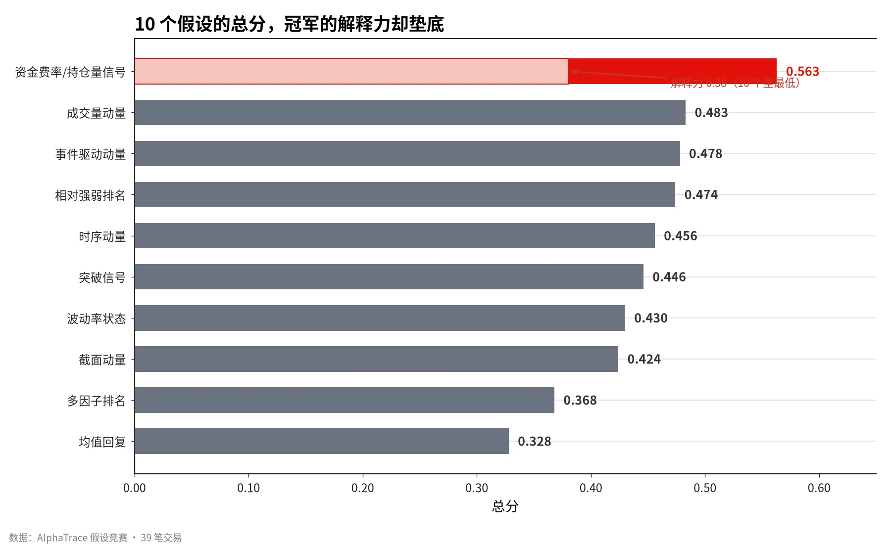
But that doesn’t mean it explains things correctly.
Two Scores You Must Not Conflate
This taught me to see “scoring” in a new light:
A high total score ≠ strong explanatory power. funding_oi_signal ranks first overall at 0.563, yet its explanatory power of 0.38 is the lowest of the bunch. If you only looked at the leaderboard’s total score, you’d walk away thinking “these trades are driven by funding rate signals,” when in fact this hypothesis explains the data worse than any other.
Simplicity is a double-edged sword. Fewer parameters genuinely do make a hypothesis more credible (harder to overfit), but “simple” and “correct” are two different things. A one-parameter hypothesis can be simple and wrong.
The platform’s evidence panel says it plainly: this is a “falsifiable explanation, not a validated strategy.” There’s one more critical warning — when funding rate and open interest data is missing, this hypothesis degenerates into a spot-market proxy (positive returns + high volume ranking), which overlaps heavily with the runner-up, volume_momentum. In other words, for the majority of trades that lack derivatives data, its so-called “explanation” is basically the same thing as volume momentum.
Validation: Plateaus and Spikes
A leaderboard alone isn’t enough; you also have to check whether the strategy is just a “tuned coincidence.” That’s what the validation page does.
It sweeps the hypothesis’s parameters across a range, re-scores at each value, and plots the result. There’s exactly one thing to look for in that chart:
- Plateau (scores stay flat across a wide range) = good news. The result doesn’t hinge on one lucky value, so the pattern might be real. funding_oi_signal was judged here as a “plateau — robust.”
- Spike (one lonely peak with everything else flatlining) = danger. That score was luck-fitted; nudge the parameter and it collapses. That’s called overfitting — mistaking noise in history for a pattern.
funding_oi_signal passed this test (plateau, robustness 0.90). But that only tells us “it isn’t overfit” — not “it’s right.” A hypothesis can be free of overfitting and still explain things wrongly: simply and steadily wrong.
Event Study: A Total Wipeout
The platform also has an event-study module that tests “when a certain type of news drops, does the price move in a regular way afterward.” I loaded 23 real historical events (product launches, earnings, regulation, partnerships, executive changes, exchange listings), grouped them by “token + event type,” computed post-event price moves, and ran statistical tests.
There’s a big statistical trap here that has to be spelled out. Suppose you test 20 groups of “news vs. price moves” at the same time. Even if every piece of news is meaningless noise with zero relation to price, pure luck will make roughly 1 group look “significant.” The more tests you run, the easier it is to stumble onto fake patterns. This is the multiple testing problem.
The platform corrects for it with FDR (false discovery rate control) — the “significance” bar is raised in proportion to how many groups were tested. Only results that survive the FDR correction count as real signals.
This time the result was: 11 groups formed, 9 went into testing, and not a single one passed FDR (q value around 0.79 — nowhere near the threshold).
Once again, this isn’t the program failing — it’s an honest result. With single-digit sample sizes per group (for example, only 3 regulatory events for a given token), no pattern, however pretty it looks, can survive the test. The correct reading is: “not enough data; no reliable pattern can be seen yet.”
Correlation ≠ Causation
One last reminder that runs through the whole exercise. Even if you did find that “prices always rise after a certain type of news,” that’s still just “happening together,” not “the news caused the rise.” There could be some other underlying driver that just happens to coincide with the news.
That’s why the platform pins “correlation ≠ causation, history ≠ future” next to every statistical result. No matter how good an event-study backtest curve looks, it only means “in this sample, over this period, following this rule would have made money.” A different window may tell a different story.
The Methodology I Took Away
- If the sample is too small, don’t draw conclusions. 39 trades, 3 valid data points — nothing “significant” can stand on that. The FDR correction wiping out every group is the data honestly telling you “not enough yet.”
- Don’t just look at the total score — look at the subscores. The hypothesis ranked first overall may have the worst explanatory power. Knowing how it won matters far more than knowing where it ranked.
- Simple and correct are two different things. High simplicity is a virtue (it guards against overfitting), but a hypothesis can be both simple and wrong.
- A plateau is not the truth — it’s just “doesn’t look like luck.” Passing validation only rules out overfitting; it doesn’t prove the hypothesis right.
- Correlation ≠ causation. The best-fitting explanation is a “falsifiable explanation,” not a “validated strategy.”
What AlphaTrace gives me is evidence-backed hypotheses, not guaranteed answers. It upgrades me from “blindly following the crowd” to “knowing what I’m following — and how reliable it is.” But real profits and losses will always come down to my own discipline.