
10 Styles at a Glance
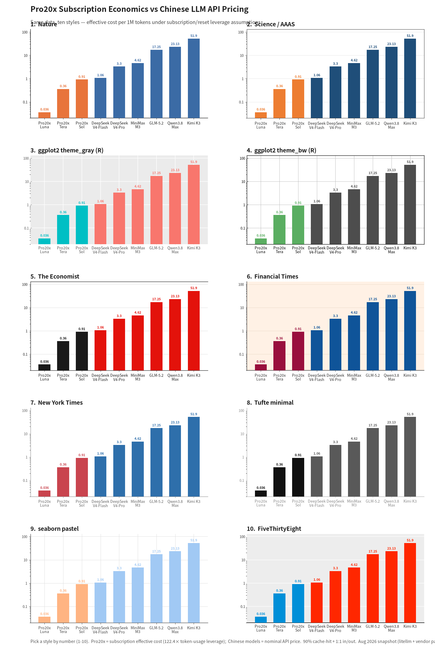
The same dataset — pro 20x subscription vs. domestic Chinese LLMs, cost per million tokens on a log scale — rendered in 10 publication-grade styles. Whether you want a paper look, an editorial feel, or minimalism, pick your fighter. Here’s a breakdown of each color scheme and its ideal use case.
The 10 Presets
1. Nature — White background, no grid, thin black spines, steel blue #3B6BA5 + warm orange #E8743B. The most “academic paper,” a serious chart that doesn’t compete with the text. Author’s default preference.
2. Science / AAAS — Light y-axis grid, full thin border, deep blue #1F4E79 + orange #ED7D31. One layer of grid more than Nature, making precise reading of values easier.
3. ggplot2 theme_gray (R classic) — Gray panel + white grid, instantly recognizable to R users; #F8766D / #00BFC4. Author’s default preference — nothing feels more familiar to someone who’s worked in R.
4. ggplot2 theme_bw — White panel, black border, dual-axis gray grid. Cleaner than theme_gray, standard for formal reports.
5. The Economist — Signature red #E3120B, top spine, faint y-grid. Strong editorial feel, ideal for news and current-affairs visuals.
6. Financial Times — Salmon-pink background #FFF1E5, navy blue + burgundy, faint salmon grid. A natural fit for finance and economics content.
7. New York Times — White background, charcoal-gray text, restrained, no grid, generous whitespace. The cleanest option, perfect for embedding in long-form articles.
8. Tufte minimal — Hairline axes, no grid, gray + black, extreme minimalism. Data-to-ink ratio pushed to the limit; best for print contexts.
9. seaborn pastel — White background, soft grid, pastel-colored bars. Gentle and easy on the eyes; great for side-by-side multi-series plots.
10. FiveThirtyEight — Gray background, bottom spine, bold lines, vivid colors. Data-journalism blog aesthetic, lively and engaging.
My Default
For everyday blog charts I lean toward Nature and ggplot (theme_gray / theme_bw): white backgrounds, restrained palettes, works with anything. Familiar to anyone with an academic or R background. I only switch to FT or Economist for finance or cost-related pieces. This cheat-sheet itself was generated using the scripts below.
How to Reproduce
Both scripts live in tools/:
gen_pro20x_chart.py— single chart,--styleflag to switch presets (defaultnature).gen_pro20x_presets.py— this 10-in-1 comparison sheet.
Both depend on the styles.py module from the scientific-charts skill: call apply_style(fig, ax, preset_name) after plotting, which returns the color palette and resets spines, grid, and ticks. Pure matplotlib + PIL, no seaborn.
| |
Full preset names: nature science ggplot_classic ggplot_bw economist ft nyt tufte seaborn_pastel fivethirtyeight.