From “Looking Good” to “Having Substance”
After the first batch of 13 non-Lynx directions went live yesterday, I set a new requirement: another round, this time with geometry, mathematics, and a strong design sensibility.
This requirement actually marks a shift in my thinking. In the first batch, many concepts were “drawn by feel”—they looked nice, but ask “why does this shape look like this?” and the answer is often just “because it looks good.” A truly enduring logo, though, usually rests on an explorable structural logic. In designer speak, this is called construction geometry: every arc, every tangent point, every proportion derives from a precise geometric system, not a shaky hand.
So I switched prompts, shifting the generation methodology from “freehand creativity” to the construction geometry techniques used in brandkit design, and added a hard rule: every concept must have a verifiable mathematical identity, stated in one sentence in the description.
Four Mathematical Families
This time, four agents ran in parallel again, but each was assigned a specific mathematical domain:
Euclidean Line Drafts — classical compositions using only circles, arcs, and straight lines: chains of mutually tangent circles, nested regular polygons, Reuleaux triangles (constant-width curves), and circle-square harmony.
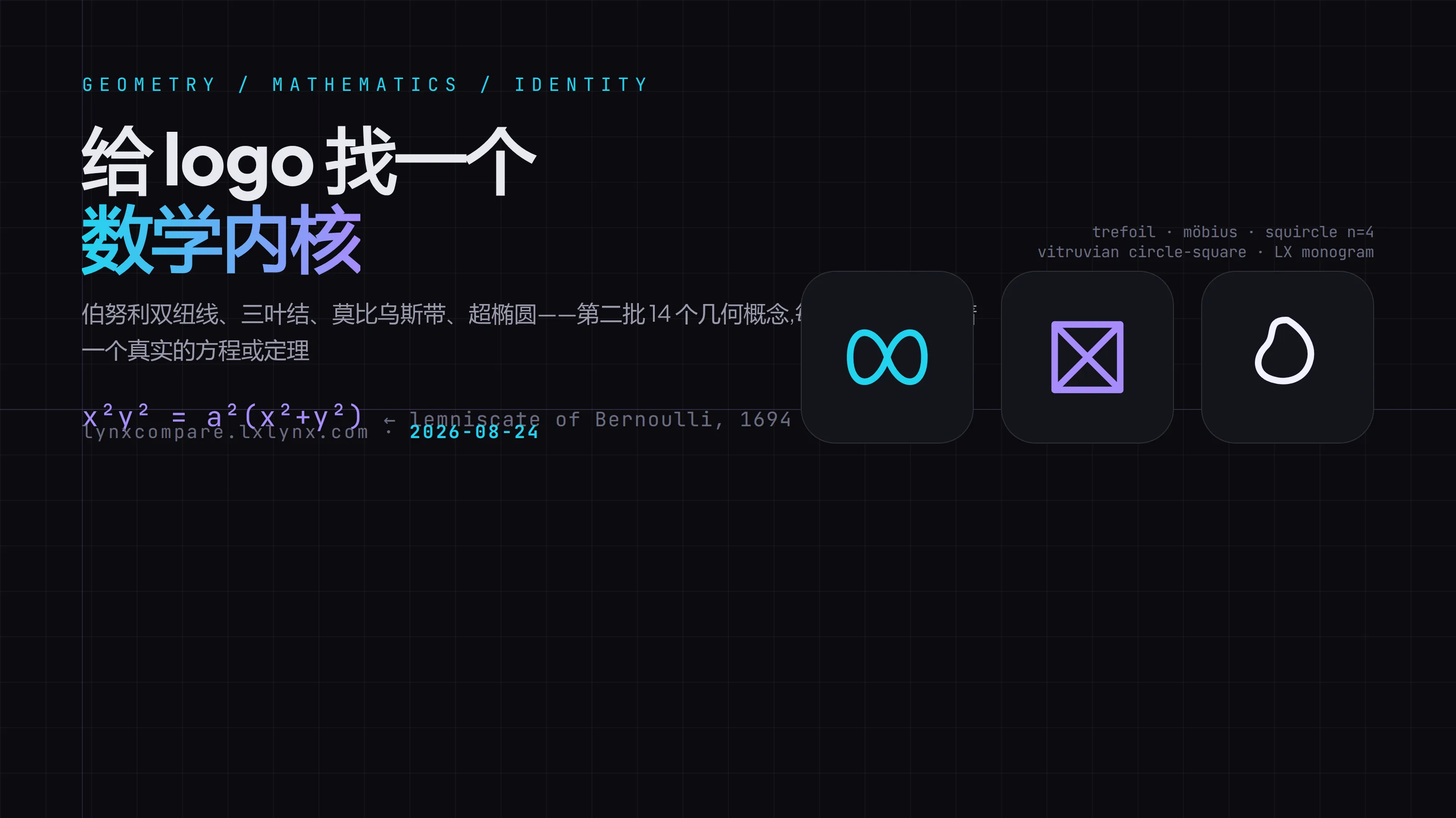
Mathematical Topology & Equations — forms with genuine mathematical identities: trefoil knots (knot theory), Möbius strips (one-sided surfaces), superellipses (squircle equations), and Bernoulli lemniscates.
Negative Space & Optical Illusion — the third shape emerging from rectangles and diagonals, rotational basis transformations, where intersection points become pupils.
Construction Geometry × LX — recasting the LX letterforms through geometric construction: a modular relationship where L and X share vertices.
A few of the outputs truly impressed me, and deserve a closer look:
Bernoulli Lemniscate (Reviewed: 98). The ∞ symbol I’ve always liked actually has a mathematical prototype: in 1694, Jakob Bernoulli studied this curve and wrote down the equation x²y² = a²(x²+y²). It looks like an 8 lying on its side. Using this real curve as a logo means “infinity” isn’t just a drawn slogan—it’s a mathematical object with over three centuries of history. That narrative weight is an order of magnitude stronger than sketching a casual ∞.
Trefoil Knot (96). The simplest non-trivial knot in knot theory: if you wrap a string into a three-lobed crossed loop, you can’t unravel it back to a straight line without cutting the ends. It’s literally the first page of a topology textbook, and its mathematical pedigree is rock solid.
Möbius Strip (94). A one-sided surface: traverse the band’s surface in a full loop and you return to your starting point without ever turning it over—the most iconic metaphor for endless loops and unified wholeness.
Superellipse (91). Governed by |x/a|ⁿ + |y/b|ⁿ = 1, this shape sits between a square and a circle when n=4. Apple’s iOS icon rounded corners are built from this exact curve family. If a logo’s outline is naturally a squircle, it speaks the same visual language as contemporary app icons.
X Eye Cut (99, highest overall). Surprisingly, this one is the simplest: a square plus two diagonals. Its mathematical core is a basis transformation rotating the Cartesian axes by 45 degrees, with the intersection naturally forming a “pupil.” Fewest elements, strongest sense of gaze, and it stays razor-sharp even at 16 pixels.
Math Names ≠ Math Shapes: Half the Approved Concepts Got Culled
Sixteen concepts passed the review agent. But learning from the first batch, I insisted on manually checking every rendered output before going live. This time, six were culled, and they revealed a pretty interesting pattern:
Agents can nail the mathematical name but fail to draw the correct mathematical shape. Two prime examples:
One called a “Lissajous Curve,” claiming to be a closed orbit generated by the parametric equation x = a·sin(nt + c). The render came out as a tilted egg shape—it is a closed curve, alright, but it has none of the signature traits of a Lissajous figure (which is defined by that interwoven, symmetric grid-like pattern). The name was right; the shape had nothing to do with it.
Another called “Infinite Fold,” described as “a single continuous zigzag forming an ∞, with the turns creating an X-shaped negative space.” The render turned out as a tangled mess. Forget the X negative space—you couldn’t even make out an ∞.
And the “Trefoil Knot” one—even though it ultimately passed review and made it to the showcase, I have to be honest: a true trefoil knot has three distinct over/under crossings (the string passes up and down at each intersection), and a single SVG path struggles to render that specific weaving accurately. The version currently on display is its projected silhouette. It’s close, but not a rigorously accurate knot diagram. This is a compromise I made between mathematical precision and graphical readability, and it’s worth noting.
Translating this pattern into engineering terms: generation agents excel at association and naming, but struggle with precise drafting; review agents read path coordinates, not rendered visuals; only manual rendering checks can catch “name but no substance.” Across three pipeline runs, this conclusion has been validated twice.
What Made It to the Stage in the End
The second batch brought 14 directions to the stage, and combined with the first batch, the “AI Company New Directions” tag on the comparison board now holds 26 candidates. Among the newly added mid-tier options, these three are my strongest picks:
- LX Shared Stroke (94): The vertical stem of L shares a vertex with X, forming both letters within a single triangular zone. This is a revised version—the original “LX Construction” rendered an X so faint it was unreadable. I instructed it to draw both diagonals of the X fully, sharing the starting point with L, and the letterforms instantly locked into place.
- Gaze Core (93): A solid dot centered inside a superellipse shell. Part eye, part camera lens—the equation and the imagery share the same roots.
- Vitruvian Frame (95): A square enclosing a circle with diagonal cross-bracing, translating Leonardo’s Vitruvian Man proportions into a logo. It carries the strongest classical resonance of the group.
All 26 candidates live at lynxcompare.lxlynx.com under the “AI Company New Directions” tag. You can compare them side-by-side across dark, light, and gradient backgrounds, and directly click to keep or discard any.
As of now, no final decision has been made. The 26 candidates are laid out; let your eyes sort through them: first-glance infatuation can deceive, but a hundredth-glance endurance will not.