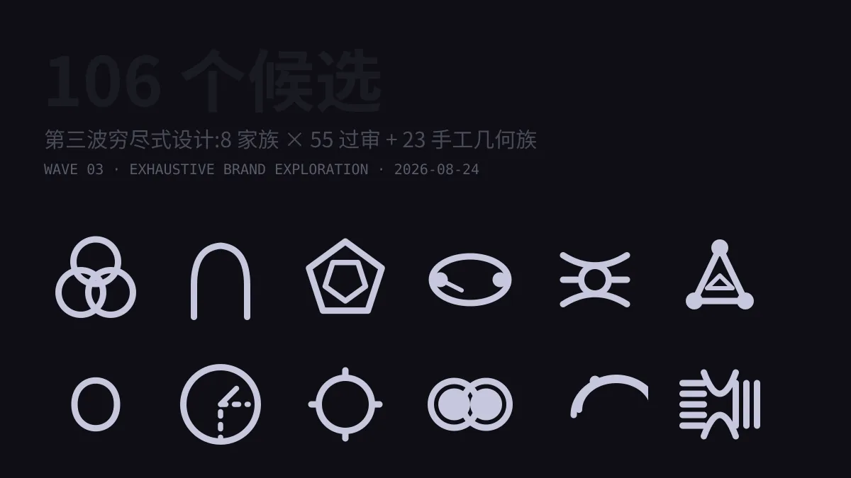
Goal: One Hundred Comparable Candidates
After the first two batches, there were 28 directions on the comparison board. This round’s goal was much more ambitious: fill the board with one hundred usable logo candidates and lay them all out so I could pick through them one by one.
“Usable” and “padding the numbers” are two entirely different things. The lessons from the first two batches were clear enough: the agent reviewer only checked path coordinates, not actual rendered output, so botched concepts could sail through with a green light and end up on the board. So this wave followed a three-layer filter: generate → review → render check. Every layer had to actually work.
Wave Three: Eight Families in Parallel
The generation stage kicked off 8 parallel agents, each assigned a direction with a completely different visual vocabulary. Concepts had to be able to name the real structure they belonged to—not just generic “pretty node connections”:
- Neural & attention topology — star networks, small-world networks, synaptic branching, each mapped to an actual graph theory concept;
- Light & signals — light cones, double-slit interference, pulse sequences, real optical physics rather than decorative glow;
- Structural construction — honeycomb, lattice, waffle slabs, precisely symmetric the way an engineering drawing would be;
- Growth & life — cell division, root systems, tree rings, abstract generative processes;
- Dialogue & voice — echo arcs, verbal spirals, broadcast towers, metaphors drawn from communication systems;
- Time & cycles — sundials, hourglasses, beat points, the geometry of timekeeping devices;
- Data & matrices — 3×3 matrices, sparse point arrays, L-shaped lines, the shape of data structures themselves;
- Brutalist masses — solid blocks, 90° right angles, white negative-space cuts designed with industrial sensibility, shaping the LX letterform into a mechanical stele.
Each of the 8 agents produced 12 concepts, for a total of 94.
Review Split Between Two Agents
The first review attempt failed: stuffing all 94 candidates into a single agent for one-shot scoring blew past the structured-output retry limit and the entire workflow crashed. After diagnosing the issue, I split the review into two agents, each evaluating 47 candidates. The workflow ran with cache persistence—generation results all hit the cache and only the review re-executed, producing results in seconds: 55 passed, a 41% rejection rate.
The harshest rule in the review criteria was the duplication check: any candidate that resembled any of the existing 28 concepts by more than 80% was sent back for a completely different direction. This guaranteed that the hundred candidates weren’t just fifty ideas in different colors.
When the Machine Can’t Run a Browser
Before deployment there was one final gate: visual render inspection. But that day WSL’s RAM and swap were completely maxed out, the load spiked to over 200, and Chrome headless simply wouldn’t start. The screenshot route was dead, and I wasn’t about to ship botched renders.
New approach: if we have no eyes, let the numbers speak. Using sharp, a low-level image library, I rasterized every SVG and computed three metrics—ink coverage (whether the shape still has presence at 16px), edge contact (whether any path escaped the canvas), and bounding box (whether coordinates overflowed). All 55 concepts ran through the checks, none exceeded bounds, and every one retained a recognizable ink mark at 16px. Only then did I feel confident shipping them.
This approach couldn’t rescue aesthetic blur, so for the 23 hand-crafted concepts I imposed a discipline on myself: only construction geometry I can verify with my eyes closed—circles, 45° diagonals, Bézier curves with integer control points. Celestial mechanics, crystallography, fluid dynamics, topology, cognitive schemas, architectural sections—each still had to carry a real intellectual core: Borromean rings, Hopf links, Hohmann transfers, Keplerian foci, flying buttresses. The names themselves were geometry.
By the morning of August 24, the comparison board’s “AI Company New Directions” tab had 106 candidates: 28 from the original batches, 55 from wave three, and 23 hand-crafted geometry entries. The scores are just numbers; rankings are for reference only—the final call is always the eye. When picking a logo, one out of a hundred will always be the right one.