
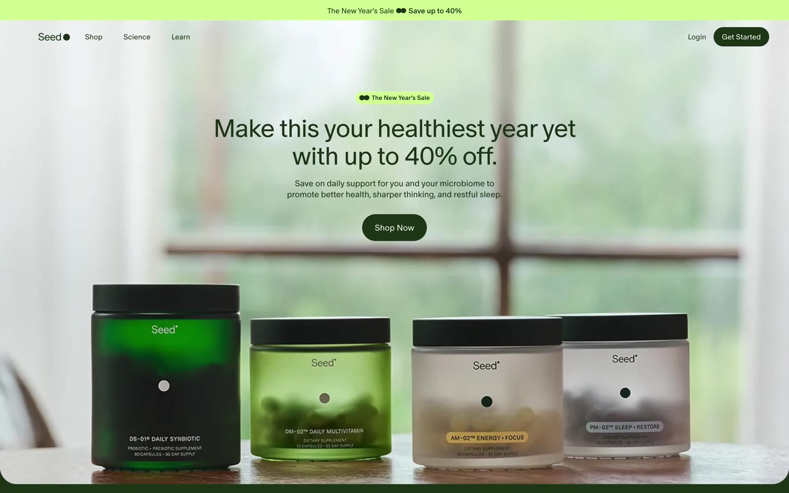
What does a typical health product e-commerce site look like? Full-width image carousels, red banners with yellow promotional text, “Limited-Time Offer” countdown timers, scrolling customer testimonial widgets.
Seed Health—a company selling probiotics and dietary supplements—does the exact opposite. Its homepage features a frosted-glass product lineup, deep green serif typography, and a headline with no exclamation mark: “Make this your healthiest year yet.”
The “Scientific Feel” Built on a Three-Color System
Seed’s visual language uses only three colors: black, white, and deep green. That’s it. No fourth color.
The psychological mechanism is clear: green signals health and nature; black and white signal academia and rigor. Together, they communicate “we look more like a research institution than a retail store.”
That’s a devastatingly effective differentiator for the health category. The biggest trust barrier in supplements is the question “Does this actually work?"—Seed’s visual language addresses that doubt before the visitor has even read a single word of copy.
The Magazine-Style Reimagining of E-Commerce
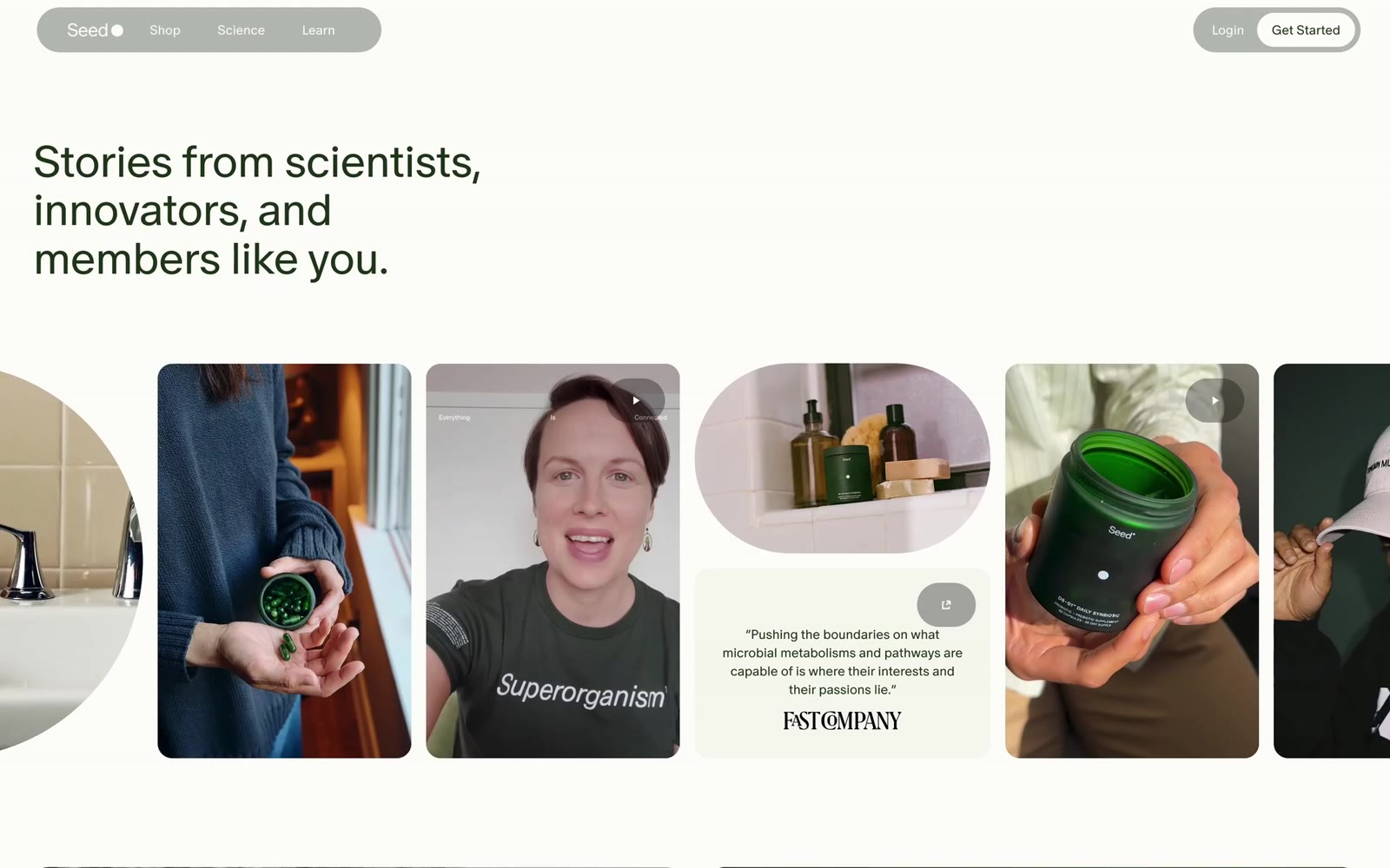
Scroll further, and Seed reveals its strongest section: Stories. The headline reads “Stories from scientists, innovators, and members like you”—note the word stories, not reviews.
The layout completely breaks the grid inertia typical of e-commerce sites:
- Mixed shapes: Circular-cropped photos, portrait video cards, oval cards, and plain-text quote blocks are interwoven, resembling a meticulously designed lifestyle magazine
- Media endorsements instead of user testimonials: Quote blocks feature original lines from Fast Company, credited to the publication rather than a “satisfied customer”
- Product as content: Close-up product shots appear interspersed with scientist interviews; the sales intent is fully concealed within the narrative
Designing Promotions to Be Inconspicuous
An interesting detail: Seed doesn’t shy away from promotions—the hero banner reads “The New Year’s Sale, Save up to 40%.” But the execution is radically different from conventional e-commerce:
The promotional banner uses the brand’s fluorescent green, keeping it cohesive with the overall palette. “Save up to 40%” is set in the headline itself using serif type, integrated as part of the body text rather than rendered in italicized red with exclamation marks.
Promotions are “downgraded” into natural page elements rather than visual noise. This reflects a judgment about brand equity: the conversion lift from a sale is a one-time event, while the brand trust built by the site’s aesthetic compounds over time. Sacrificing the latter for the former is a bad trade.
Three Takeaways for Building a Brand Website
1. Category defaults are your differentiation opportunity. Because every health e-commerce site looks the same, “looking like a science journal” becomes a positioning strategy in itself. Study your competitors’ visual conventions first, then deliberately do the opposite.
2. Rank trust signals this way: authoritative media > user testimonials > self-promotion. Seed places Fast Company coverage in the prime real estate while user stories recede into a “community” section. Most Chinese brand websites are still stuck at the self-promotion stage—that’s a ready-made edge.
3. Promotions don’t have to be ugly. Handling discount information in brand colors and body-type fonts can achieve conversion rates not far below red explosion stickers, without burning through brand equity.
Seed Health’s website proves that the ceiling for an e-commerce page isn’t “optimal conversion rate”—it’s “making brand premium justifiable.” When visitors perceive the brand as trustworthy and scientific, a 40% discount is simply the final nudge.
Recreation Prompt: Let AI Build a Same-Style Website
When building a website for a health, lifestyle, or consumer goods brand, this prompt will generate a first draft with a “science journal” feel:
| |
Key recreation note: 80% of this style’s effect comes from color discipline—as soon as a fourth color is introduced, the “scientific feel” collapses into a generic e-commerce site. The choice of serif typeface matters more than you’d expect: too classical and it reads like a law firm; Source Serif sits just right between “academic” and “consumer brand.”
This article is based on a frame-by-frame analysis of the Seed Health website, part of the Lingxu Technology “Website Appreciation” series. We specialize in website development, turning creative vision into high-performance modern sites.